-
May 21 2018 The process of designing a level
Jumpy Zergi production Log #2
In our second Jumpy Zergi post, we will talk about the level design process of the game. As we mentioned in our previous Blog Post, Jumpy Zergi is a challenging auto-scrolling 2.5D platformer, in which both the level and inputs from the player are synced to the soundtrack. We will focus on the challenges and difficulties we had to face while in the creation process and in which ways we overcame them.
From the very start of development, it became clear that building a level, that syncs up well with music, is a lot more challenging than first anticipated. We also noticed very early on, that the level would feel too repetitive, without some changes in gameplay. This is why we implemented different speed modifiers and gravity switches, although these features were at first not intended. The first two out of nine sections were built quite early in the game so we could test and balance all the different features. After all the gameplay features have been completed, we continued with the design of the level layout under the following guidelines:
- Interactions and environment should sync up well with the soundtrack
- Balanced difficulty
- Avoid repetition
- Prevent the feeling of unfairness
- Optional alternate and more difficult paths for collectibles
Syncing to soundtrack
Syncing the level to the soundtrack was the first priority when creating it, as this is the most important factor for whether playing the game would be satisfying. When we first started to build a new section, we only used the absolute minimum amount of blocks or platforms on key positions, until we got the syncing right. Only then came balance and design. Even though there is only one input, jump, there are actually more things the level can sync to: jumping, landing, triggers and passing of obstacles or passages at the right time, which is either a distinctive note or beat. We placed small editor guide objects for each of those key moments via a script, tapping along to the music, while the script takes care of positioning the guides.

Semi-automatically placed guides Also to be considered were the different distances when either jumping or falling, at all the different speeds we have in the level. We kept everything in grid units, which not only makes building the level less complicated, it also looks more appealing and less chaotic that way.

Jump and fall distances at different speed settings Ballance
Most sections were a bit too hard when they were first created and later sections were quite a bit harder than earlier ones as well. It was somewhat intended to have an easier start and end with more difficulty in between, but it drifted apart too much. This became especially apparent, when we had our first external testers have a go at the Jumpy Zergi level.
We also made sure, that there are several “break”-parts in the level, were no input is required for a short time. Another important design philosophy was that the level needs to be readable. This means that the elements ahead should be visible before the player needs to act and not pop into view right before the player needs to react to them.

Example of a break section Additionally, we also prevent too narrow timings (precise inputs at exactly the right time) and platforms that are too easy to miss. Instead we increase difficulty by the amount of inputs and the speed of movement.
Avoiding repetition
To keep the level more interesting, each section has been designed with a certain style, one section might consist of floating platforms, another of pillars. As I mentioned earlier, this wasn’t quite enough so we introduced up-side-down gravity and three different speed settings, which are triggered at the start of sections. Additionally, there are also visual effect triggers which can change the color of the glowing outline or the blocks themselves.

Example of how a section might look completely different in both block layout and color – still work in progress Prevent feeling of unfairness
The thing about fairness in games is, things that are exactly as they look like generally feel unfair. Failure or deaths would often seem without reason, which can lead to frustration. This is why in many games, as well as in Jumpy Zergi, there are several things in place to help the player out a little.
The most major adjustments are colliders and hitboxes. Zergi’s collider is actually a bit wider than the visual model, which allows the player to land on platforms easier, if he jumped too early. In contrary, the triggers which check for collisions with things that would kill the player are actually smaller than what they appear to be, which causes very slight spike touches to simply not register.

left – character collider / middle – trigger for block collision / right – trigger for spike collision / far right – spike model size vs trigger size Another feature is an early jump timer. Every time a player jumps when still in the air, a small timer keeps querying the grounded state for a few tenths of a second. Should the character land on the floor or on a block in that time, a jump input will occur automatically. This type of feature can be found in almost any game that has jumping in it, without anyone noticing. People will notice if it is missing though, followed by the familiar thought “I definitely jumped, why didn’t the character jump?”.
The same feature but for jumping late is also implemented in many different games. Instead of using one raycaster¹ to detect the grounded status, there are two with one at the front and one at the back of the character. This allows for late jumps to still register and prevents the same frustrations as with jumping too early. Also note, while the Zergi character rotates when jumping, this does actually only effect the visual model. All the game components only move with the controls, but not with the characters animations.
¹ a raycaster sends or casts a ray in a direction (in our case down) until it hits a collider, at which point it returns several data about the collision like name and hit coordinates.
Collectibles
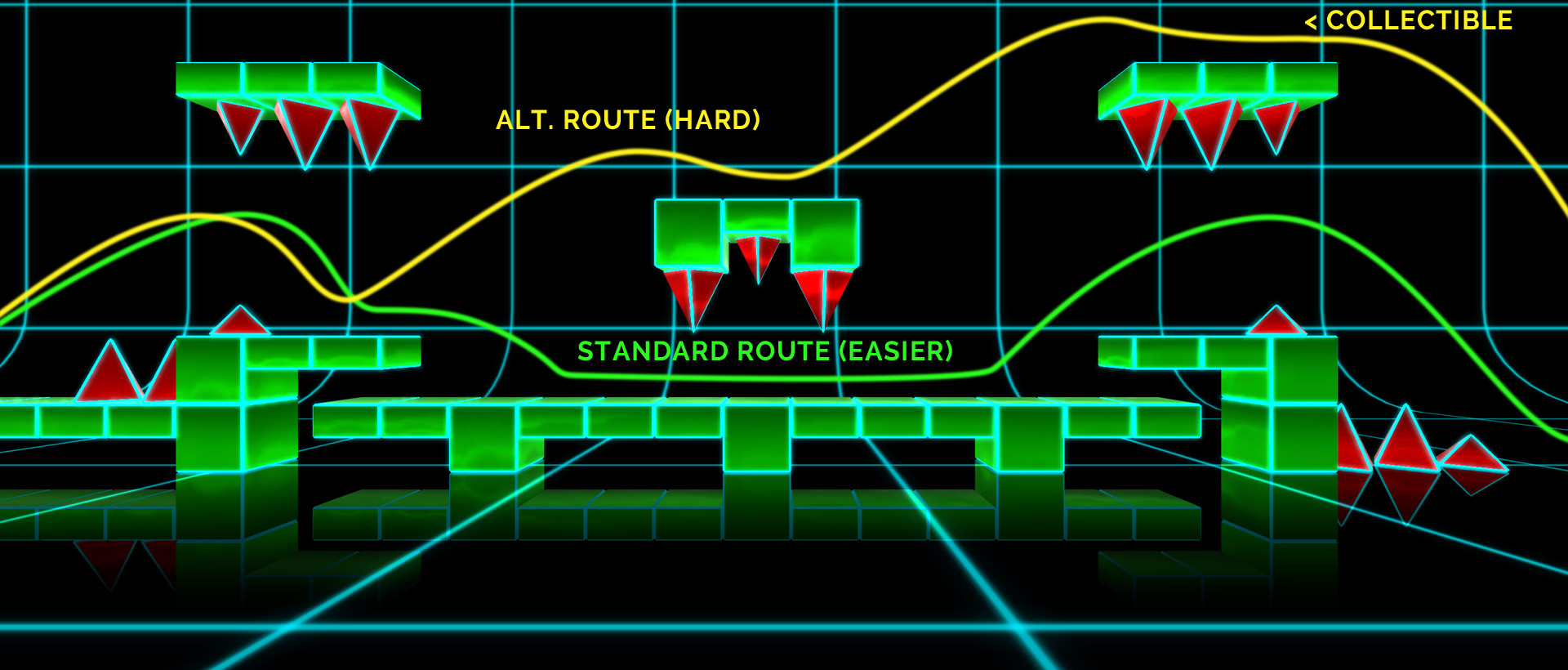
To give the level a little more replayability and make the game more interesting, alternative and harder routes which are sometimes hidden, have been built into certain spots in the level. These paths will contain collectibles (probably coins), which have not yet been implemented. Since they are only a secondary feature, they were mostly added to a section later, when the section was already completed.

Standard and alternative route, which will contain a collectible Short update on current progress:
The level design for the first level is now completed, as well as the testing and balancing of it. A bunch of new features have been implemented, like block animations, color animations, audio controls and some UI options. Next will be the finalization of major features, a proper menu and the practice mode. It also became clear, that we will need a more beginner friendly second level, which will then become the first.
As always, keep an eye on the next Jumpy Zergi post, where we will show you some features of our game and how we created them.
